This Post Will Help You Design Great Presentations

There was a time when only select people with special skills could create high-quality visuals, while the rest of us created a five-year old’s doodles on the fridge. Today, however, there are a number of tools at our disposal, from Prezi to Canva to Pixlr, that make it easy to express your ideas visually. If you feel that you don’t have the skills, resources, or time to create effective visuals to go along with your presentations, then this post is for you. With the help of a few basic design principles, anyone can create beautiful visuals quickly and easily.
1. INSTRUCTIONAL AND GRAPHIC DESIGN

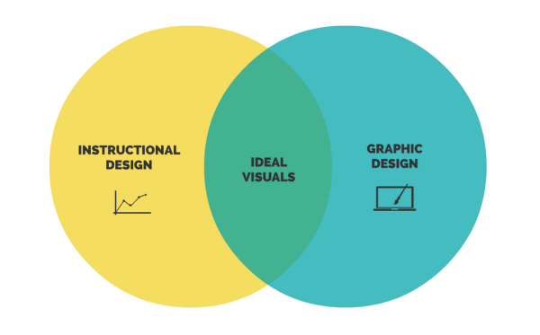
There are two types of design when it comes to presentations: instructional design (graphs, diagrams, flowcharts, and visual hierarchies) and graphic design (illustrations, symbols, fonts, and colors). If you’re used to presenting lots of data, you probably rely heavily on instructional design. On the other hand, if you’re more of a storyteller, graphic design may be your go-to choice for presentations. The key is to maintain a balance between these two types of design—effective presentation visuals use both of these types to express information. Take a look at the examples below; one places too much emphasis on instructional design, the second overemphasizes graphic design, and the third marries the two in perfect visual harmony.
2. SPACE AND MOVEMENT
You need to be careful about how you use space—the surrounding area between and around the different elements in your presentation. Make sure you leave enough white space, or emptiness, around each element, in order to avoid having a presentation that looks too busy. Movement, or the way your presentation transitions between ideas, is important, especially in a tool like Prezi, because it gives you the power to control how your audience sees and interacts with your presentation. Take a look at these two examples of movement; the first presentation does not utilize movement to show the relationships between ideas, while the second does utilize movement effectively.
3. PROXIMITY AND ARRANGEMENT
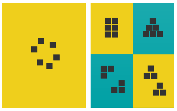
It’s important to pay attention to proximity—the distance between different elements—because it can indicate certain relationships between ideas or images. For example, two symbols directly next to each other appear, to us, to be related, while two symbols that are further apart seem like separate ideas.
You can also use the arrangement of the different elements on your canvas to visualize the relationships between your ideas. Take a look at the examples below to see how different arrangements suggest different ideas.

4. CONTRAST AND CONSISTENCY
Contrast is used to show variety—the higher the contrast, the more striking the difference. Using contrasting typefaces to emphasize certain parts of your message can enhance its visual impact. If you’re interested in typography, Typekit from Adobe is a good resource. Another convenient application Wordmark.it lets you preview all the fonts installed on your computer right in the convenience of your browser.
The same goes for color choice. Having knowledge of color’s effects on perception is key to effective visual communication. Different colors convey different emotions and subtly influence people’s perception of the information being presented—for example, red text conveys a very different message from black text. There are several online resources for creating color combinations.

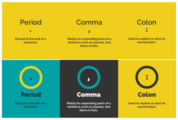
The above image uses consistency to bring the three types of punctuation together, while the bottom example highlights differences between the three elements through contrast.
Consistency, on the other hand, is the use of uniform design elements throughout your presentation. The human brain is wired to look for patterns and similarities, so consistency in your visuals will help your audience quickly understand the information you’re presenting. To achieve a consistent look, use the same font (typeface, size, and color) for all top-level headlines throughout the presentation, use the same color palette for symbols and illustrations, and stick with a single visual metaphor or theme. The audience may not necessarily recognize these patterns consciously, but consistency will help them follow your presentation.
These principles of design will help you make your presentation’s content easy for your audience to process so that your message is effective. Your goal is to keep the design aspect of your presentation silent so that it does not overpower your message and instead aids your conveying of information.
Courtesy: http://blog.prezi.com/latest/2014/8/13/this-post-will-help-you-design-great-presentations.html
