Microsoft announces two brilliant PowerPoint 2016 design tools

You can now select professional designs that radically improve your slides and creates animations that add visual interest.
Microsoft is on a roll with the new Office 2016 suite.
I’m impressed not just with some of the new features–in particular, the team-editing capabilities in Word 2016 that let everyone edit the same document–but with how the company is working to add new features even though the app debuted just a few weeks ago.
Efficiency – a busy man at his desk, surrounded by chaotic paperwork
Efficiency hacks for IT: 6 tips for getting things done
Modern tech leaders wear many hats — too many, sometimes. Here are six expert tips from seasoned IT
Read Now
Just today, Microsoft announced two new features in PowerPoint 2016. Chris Maloney and Sean Villaron from Microsoft, who lead the PowerPoint 2016 program, showed me the features in a Skype demo this week and explained how they work.
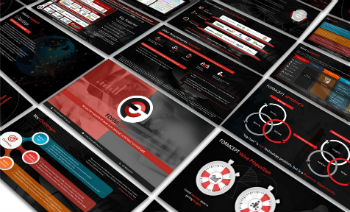
First, a new Designer feature is a bit like a real-time template. You can create all of your slides the way you normally do, with a template or without. You lay out the images and text, get everything in the order you want, and even create all of the timings and transitions. Then, you pick the Designer tool. As Maloney explained, it’s like taking your slides and giving them a graphic designer who knows how improve them even more and wow an audience.
It was amazing to see how the Designer feature offered several variations. In a slideshow with some text and photos, the Designer created a new version that put the images into a frame that looked like it was hanging in an art gallery. You get five to choose from.
Another interesting aspect to the Designer is that the processing for the suggestions occurs in Microsoft Azure in the cloud, and this feature knows which designs most users pick. If none one is picking the one with the art gallery look, it won’t keep showing up. It’s the power of the crowd instilled in the app.
Another new feature called Morph reminds me of an old app called Adobe Director. (It’s still around, but I used it back when it was owned by Macromedia.) Morph lets you create animations without having to know anything about how animation works. You create some art, move it around, and Morph watches what you are doing and builds the animation.
In the demo, I saw how Villaron created some slides with planets. He moved the planets up into a row and then clicked Morph to create the animation. It’s a smart feature because it allows you to make a visual point. It’s not just intended to create some visual interest or entertain the crowd. With the planets “aligned” like that, it creates an easier way to track with the explanations. It matches with what you want to say.
The two new features will be rolled out to all PowerPoint 2016 users in the next few weeks. If you already own PowerPoint 2016 and subscribe to Office 365, you can join the Office Insider program and you’ll be able to test the new features within a week or so.
I like how Microsoft is improving Office 2016, and it’s something the company promised to do. It’s more than just fixing bugs. It matches up with the fluid nature of Web apps that sometimes change and improve on a day to day basis, yet matches with the needs of business users who prefer desktop apps. I also like how the app uses the cloud. I could see that expanding even further to make the most commonly used features easier to find.
For now, these new features work in Office 2016 for PC on Windows 10. Microsoft plans to roll out the features to additional operating systems in the coming weeks.
Courtesy: http://www.computerworld.com/article/3003499/emerging-technology/microsoft-announces-two-brilliant-powerpoint-2016-design-tools.html
