Implementing Parallax Scrolling: Best Practices

In the ever-evolving world of web design, staying ahead of the curve is crucial. One of the most captivating techniques that have gained immense popularity is parallax scrolling. This design trend not only adds a layer of depth to your website but also keeps your audience engaged with its visually appealing effects. In this guide, we’ll delve into what parallax scrolling is, how it works, and how you can implement it to elevate your web design.
What is Parallax Scrolling?
Parallax scrolling is a technique where background images move slower than foreground images, creating an illusion of depth and immersion. This effect can transform a flat, static webpage into a dynamic and interactive experience, making your content more engaging and memorable.
The Science Behind Parallax Scrolling
The term “parallax” comes from the Greek word “parallaxis”, meaning alteration. In the context of web design, it refers to the perceived displacement or difference in the apparent position of an object viewed along two different lines of sight. By manipulating the speed at which different layers move, designers can create a sense of depth, similar to what we experience in the real world.
Benefits of Parallax Scrolling
Enhanced User Experience: Parallax scrolling creates a more engaging and interactive experience, encouraging users to spend more time on your site.
Improved Storytelling: By guiding users through a narrative as they scroll, you can convey your brand message more effectively.
Increased Visual Appeal: The dynamic and visually striking nature of parallax scrolling can leave a lasting impression on visitors.
Encourages Exploration: Users are more likely to explore your site thoroughly when they are intrigued by its design elements.

Implementing Parallax Scrolling: Best Practices
While parallax scrolling can significantly enhance your web design, it’s essential to use it judiciously. Here are some best practices to keep in mind:
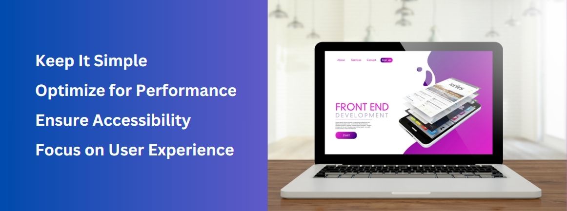
Keep It Simple: Overusing parallax effects can overwhelm users and detract from your content. Use the effect sparingly to highlight key sections.
Optimize for Performance: Parallax scrolling can be resource-intensive. Ensure that your site is optimized for fast loading times to prevent high bounce rates.
Ensure Accessibility: Make sure that your site remains accessible to all users, including those with disabilities. Test your design across different devices and screen sizes.
Focus on User Experience: The primary goal of parallax scrolling should be to enhance user experience, not just to show off a cool effect. Keep navigation intuitive and content easily accessible

How to Add Parallax Scrolling to Your Website
Adding parallax scrolling to your website can be done using various methods, depending on your technical skills and the platform you’re using. Here are a few approaches:
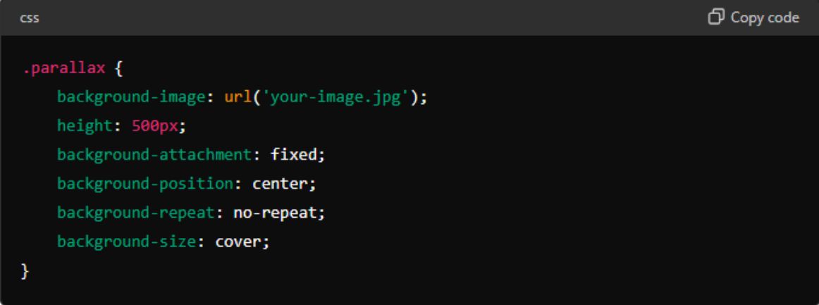
CSS and HTML: For those comfortable with coding, CSS and HTML offer a straightforward way to implement parallax scrolling. By manipulating the `background-position` property, you can create the desired effect.

JavaScript Libraries: Libraries like ScrollMagic, Parallax.js, and Stellar.js provide more advanced features and greater control over your parallax effects.
Website Builders and CMS Plugins: For those using website builders like WordPress, there are numerous plugins available that can add parallax scrolling with minimal effort. Popular options include Elementor, WP Parallax Content, and Parallax Scroll.
Examples of Stunning Parallax Scrolling Websites
Spotify: Spotify’s Year in Music page uses parallax scrolling to create an engaging narrative that showcases user statistics and highlights from the year.
Nike: Nike’s Better World campaign page uses parallax scrolling to tell a compelling story about their sustainable practices and products.
Apple: Apple’s product pages often utilize parallax effects to highlight features and create a smooth, immersive browsing experience.

Conclusion
Parallax scrolling is a powerful tool in the web designer’s arsenal. When used thoughtfully, it can transform a mundane website into a captivating digital experience. By understanding the principles behind it and following best practices, you can harness the power of parallax scrolling to enhance your web design and leave a lasting impression on your audience.
Ready to take your web design to the next level? Start experimenting with parallax scrolling today and watch your website come to life!
