Five Tips to Make PowerPoint Business Presentations More Effective

Using PowerPoint in a Business Presentation?
These five tips will make your communication more effective
It is almost expected today that you will use PowerPoint in business presentations. It can be used to add visuals to the message and is an easy way to create a leave-behind handout or e-mail the presentation to others later. But too often business presenters aren’t as effective as they could be when delivering a PowerPoint presentation. Here are five tips drawn from my training programs for making your next PowerPoint business presentation more effective.
Start with Structure First
I always start my workshops by suggesting that presenters plan their presentation on paper before they sit down at the computer. Start by defining the goal of the presentation – what you want the audience to do, feel, understand or act on when you are done. Next, describe where the audience is today in terms of their knowledge, trust of you, attitudes and roles in the organization. Once you have the starting point and destination, you can now plan the route that you will use to take the audience through your presentation. This is just like a GPS does when determining the best route from your location to a destination (this article discusses the GPS approach to planning your presentation and includes a video of me explaining the idea). Using sticky notes to lay out the main ideas and supporting data is a good way to see the entire presentation at once. Now you can decide where visuals will add to your message and what those visuals should be.

Use Colors & Fonts that are Easy to See
You don’t need to have a graphic design background in order to design slides that are visually appealing. Decide on a simple standard look for your slides so that the audience has visual consistency throughout the presentation. Select background and text colors that have enough contrast so that the text will be easy to read. Instead of guessing at whether the colors have enough contrast, check the colors with the Color Contrast Calculator. For any text, research tells us that a sans-serif font, like Arial or Calibri, is easier to read when projected, so use one of these fonts. For font size, it depends on the size of the screen and the size of the room (you can see a detailed chart based on visual acuity calculations here). But if you use fonts that are 24-32 point size as a minimum, you will usually be safe.

Use Visuals Instead of Text Slides
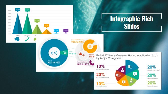
Audiences don’t want you to read slides full of text to them – surveys show it is the most annoying thing presenters can do (here is the latest survey on what audiences tell me annoys them about PowerPoint presentations). So use visuals instead of paragraphs of text. Use graphs to illustrate numeric data. Use diagrams to show processes or flows of information or goods. Use pictures to show a person, place or object. Use media clips to bring the views of others into your presentation. There are many more visuals that you can use. If you need a method for creating visuals, use the HVF approach in my book Select Effective Visuals. If you create financial presentations, check out this webinar on how to turn spreadsheets into visuals.
Practice and Rehearse
Creating your presentation at the last minute is not a good idea because it does not allow you to practice and rehearse. Practice is when you sit with your presentation and mentally review what you are going to say and how you want the flow to work. Practice is not enough, although many presenters think it is sufficient. You must also rehearse your presentation by standing and delivering it as if it was for real. This is the only way to check your words, your visuals and whether the message is as clear as you want it to be. It is also the only way to truly check your timing to make sure you don’t run over the allotted time.
End Your Presentation with Next Steps
In my opinion, the single worst way to end your presentation is with a slide that has the word “Questions???” in big bold text on it. This type of ending invites your audience to question everything you have just said and does not move them the last step towards the goal you had set for your presentation. As I have recommended to many of the presenters I have worked with, end your presentation talking about the next steps that you want the audience to take to use the information you have provided. Invite discussion of the next steps if there is time, but end with a strong call to action so the audience is clear what they are to do next. Without a call to action, the audience is likely to do nothing further, and your presentation goal will not have been achieved.
By using these five tips, your next PowerPoint business presentation will be more effective because you will provide a structure for your message and deliver it in a way that the audience will understand it. The success of your presentation is mostly determined before you ever get up to speak. Take the time to prepare using these ideas and look forward to many successful PowerPoint business presentations.

Courtesy: http://www.thinkoutsidetheslide.com/five-tips-to-make-powerpoint-business-presentations-more-effective/
