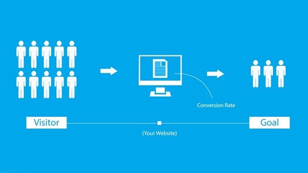
Creating a website that helps you increase your sales

A website’s main purpose should be to bring you prospective leads rather than just creating an online presence for your business. Survival of small-scale businesses is highly competitive in this day and age and especially if it’s a brick-and-mortar business. You have to stay relevant and stand toe to toe with most of your competitors.
About 88 percent of consumers are unlikely to return to a website after one bad experience.
It’s a staggering statistic, but it certainly says something about the importance of user experience in website design.
The overall experience you provide to your visitors results in creating a traction that can help convert them into genuine leads. There is more to website design than just colorful design and layouts.
The emotional connection that users feel as a direct result of the UX design directly impacts brand identity, consumer retention, and a business’s bottom line.
Plus, according to research from Stanford University, over 46 percent of consumers view a website design as a top indicator of credibility — a quality that is imperative for brands to secure to captivate new consumers and then turn them into returning customers.
Here is a list of factors that you should keep in mind while creating a high converting landing page.
1. Focus on user types, not buyer personas
Buyer personas are primarily designed to align marketing messages in your website layout. To create the ideal user experience, you don’t need to know what “Customer” specifically likes or what his/her pain points are. However, you do need to know the user types you’re targeting and how they browse and shop, which devices they use, and how they find and use your products. Create your experience around those user type segments rather than buyer personas.
2. Prioritize and Simplify
A Good website design is about keeping it simple and effective. Invite them to explore your website rather than forcing them to find what they are looking for among clustered designs with too many options seeking their attention. So keep your website clean and impactful, use images with a single character or particle rather than many particles that will overwhelm your visitors.
3. Incorporate consistent branding.
Studies show that consistent branding can increase revenue by up to 23 percent.
Plus, a cohesive visual identity across every platform and device — including your website — will aid in creating a brand that consumers enjoy engaging with, leading them to want to engage with you over and over and over again.
Top website designs use a recognizable color palette, imagery and another subtle branding in almost every page of the website.
This consistent branding creates a stable environment that empowers your users to find the products or information they are looking for without distracting or confusing them. They know where they are, what they can expect and now have the time to determine what they want to do.
4. Use Clear Call-To-Actions
Amazingly, even after they have found their way to your online site, some consumers won’t know the action you want them to take until you make it crystal clear with direct language and calls to action (CTA).
To Maximize the use of CTA button, make sure you follow these rules:
- Make buttons large and fully clickable, not just the text within the button.
- Write clear and easy verbs that will help understand the user what will happen when they click the button.
- Try using an icon which is relevant like an arrow or a shopping cart.
- Use white spaces so that there is space for the message to breathe.
5. Create for Consumers- Not for Designers.
Remember the main objective of your landing page – to convert the visitors to leads, not to impress designers with complicated or technically sound designs.
Have a clear route for your visitors to get what they want when they clicked on your link.
Make sure they leave with a positive user experience and you create a trust that leads to them subjecting their details to you. It doesn’t matter if you didn’t impress your fellow designers as long as you’re website is doing well you need not fret.
Conclusion
It is very important that you have a website that is result oriented and that can perform. The Internet is a great opportunity for you to market your product/services.
Websites are a great tool to convert your visitors to potential customers, for this it is very important that you design page that can guide your customer to get into your database or even get in touch with you through different means you have provided.
