Before & After: 6 Lessons From Mary Meeker’s Presentation Makeover

Stars: They’re just like us! We’re not the only ones creating less-than-stellar PowerPoint presentations — even the expert behind the famous annual Internet Trends Report, Mary Meeker, made poor design decisions in what was otherwise a fantastic report last Wednesday. But visual presentation means a lot, and people noticed how unattractive her slides were; in particular, a presentation designer from Paris named Emiland De Cubber.
On Friday, Bloomberg Businessweek published an article showing De Cubber’s visual reimagination of Meeker’s PowerPoint presentation. De Cubber is the same person who famously redesigned the NSA’s “hideous” PRISM PowerPoint leaked by Edward Snowden in 2013.
His redesign highlights some really common data visualization flaws that show up in presentation decks all the time. The recipe for a fantastic PowerPoint presentation is equal parts excellent content, smooth delivery, and great design — and you can’t stop at the first two!
Read on to see how De Cubber reimagined key slides from Meeker’s PowerPoint presentation. Using best practices listed in our free guide on data visualization, we’ll walk you through what design changes De Cubber made and why he made them so you can make your next slide deck even better.
Lesson 1: Use Consistent Colors
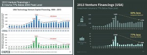
The most obvious change from Meeker’s slide (left) and De Cubber’s (right) is the color scheme. In the Bloomberg Businessweek article, De Cubber explained that using two different colors on the same slide creates a good-bad dichotomy that could confuse viewers. In the redesign, he used two colors in the same qualitative range.

When two charts appear on the same slide, use one color in different shades. The only time you should use different colors is when you want to highlight a significant data point.
Lesson 2: Space Bars Appropriately
De Cubber also made some subtle changes. Notice that he changed the width of the bars in the bar chart and the distance between each bar. To appeal most to the human eye, the space between bars in a bar chart should be 1/2 bar width.
Lesson 3: Don’t Make It Hard to Compare Data
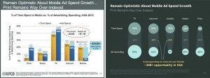
Look at Meeker’s slide below and ask yourself: where does the story in the data start and end? There’s so much going on in her slide that it’s really hard to tell. Comparing data is useless if your viewer can’t easily figure out the takeaways.
De Cubber went with a bubble chart instead of a bar chart because it “seems more appropriate and visually convincing. It’s easy to compare and the conclusion in yellow is very clear.”
Lesson 4: Use Icons to Enhance Comprehension
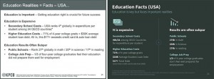
Compelling images can turn a good deck into a great deck. Check out how De Cubber turned a bland keyword slide into one that is visually compelling by using icons and complementary colors. Not only are images easier to process — which means your audience can pay attention to you instead of your slides — but they’re also easier to remember.
If you find yourself making a bulleted list on your PowerPoint slides, see if you can use symbols or images instead.
Lesson 5: Order Data Sets Using a Visual Hierarchy
I think you all can agree with me: When it comes to PowerPoint presentations, there’s nothing worse than a slide packed to the brim with words. Meeker’s slide below makes it really difficult for viewers to pick up all the key data points. De Cubber used a visual hierarchy to give the information more structure — and ultimately make it easier for everyone else to understand what data is most important on the slide.
Lesson 6: Order Pie Chart Slices Correctly
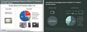
Yes, there is a right and a wrong way to order slices in your pie charts (if you need to use them in the first place). Notice how De Cubber changed the order of the slices in Meeker’s pie chart:
To create pie charts the right way, you have two options: both include placing the largest slice at 12 o’clock, going clockwise. Then, you can either place the rest of the slices in descending order going clockwise or counterclockwise. Both options are equally fine, just make sure you don’t have more than five slices in any one pie chart. De Cubber corrected Meeker’s pie chart in his rendition, and threw a few icons in there for style.
So next time you’re putting together that quick presentation for your boss, team, or client, remember these simple design tips and tricks. It’ll help them better understand what you’re presenting on. And who knows, maybe give you that extra edge you’ve needed all along.
Courtesy: http://blog.hubspot.com/marketing/mary-meeker-ugly-presentation-redesign


